Why Blue Living Room Paint Colors Create the Perfect Atmosphere
Blue paint does something special to a living room—it can make a small space feel bigger or turn a chaotic room into a peaceful retreat. This unique ability comes from how blue influences our mood and perception of space. When you choose blue for your living room walls, you’re not just picking a color; you’re setting the tone for how the room feels every day.
The Psychology Behind Blue Walls
Blue is often linked with calm and stability. It has a soothing effect that helps reduce stress and encourages relaxation. That’s why many people choose blue for spaces meant for unwinding or gathering quietly. Studies show that blue tones can also build a sense of trust and security, which makes it an excellent choice for a room where families and friends spend quality time.
Different shades of blue can evoke different feelings. Lighter blues might feel fresh and uplifting, while deeper blues create a cozy, grounded environment. These emotional responses to blue make it a powerful tool in crafting a living room that feels welcoming and balanced.
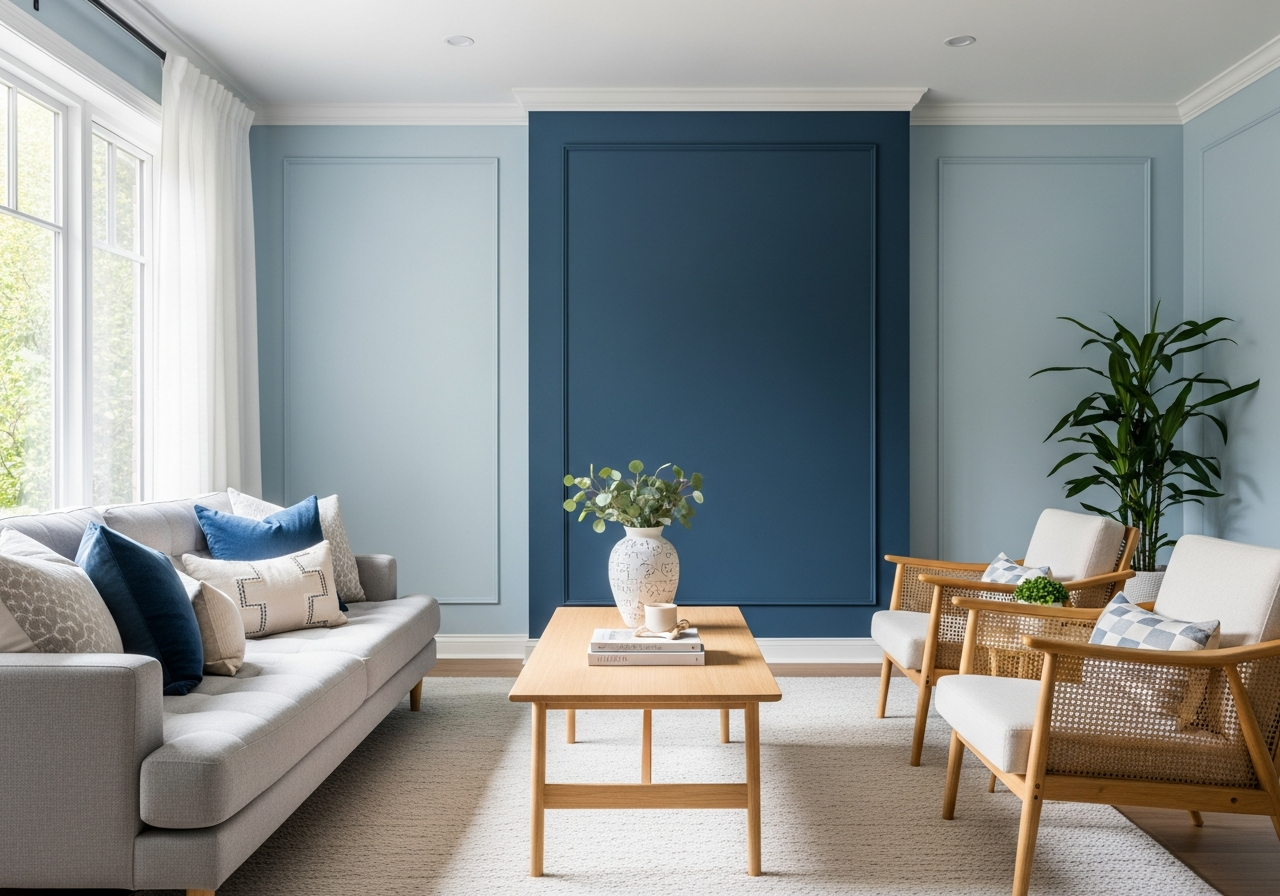
How Blue Affects Room Size Perception
Blue hues can alter how we experience space in surprising ways. Lighter blues often make rooms feel larger and airier. By reflecting more natural light, they create an open atmosphere that can enhance even smaller living rooms. This can be especially helpful in apartments or homes where maximizing space feels essential.
On the other hand, darker blues like navy or indigo can make a big room feel more intimate and inviting. These richer tones absorb light, which reduces the feeling of emptiness in large spaces. When used thoughtfully, blue paint shades can shift your room’s scale and mood to match your lifestyle and decorating goals.
Blue’s versatility means it pairs well with a wide range of design styles—from modern minimalism to classic farmhouse. It also works beautifully with wood tones, metals, and textiles, creating endless possibilities in your living room decor. Plus, blue walls adjust to different types of lighting, appearing cooler or warmer depending on the time of day and the bulbs you choose. This flexibility lets the room’s character evolve naturally with its environment.
Popular Blue Paint Shades for Living Rooms
From soft sky blues to deep navy walls, each shade of blue tells a different story in your living room. Choosing the right shade depends on what mood you want to set and how the color will interact with your space and design elements.
Light Blues for Airy Spaces
Light blues such as powder blue, sky blue, or baby blue bring a gentle and uplifting feel to any living room. They work well in rooms with limited natural light by bouncing brightness around and maintaining an open, welcoming vibe. These shades pair beautifully with white or cream accents and light wood furniture to keep the room feeling fresh and airy.
Examples of light blue paints include:
- Benjamin Moore’s “Palladian Blue” (HC-144) – soft with a hint of green
- Sherwin-Williams’ “Sky High” (SW 6496) – fresh and vibrant
- Behr’s “Baby Blue” (480C-2) – pure and calming
Bold Navy and Midnight Options
If your goal is to create drama and depth, darker blues like navy and midnight are ideal. They bring elegance and a sense of luxury to the living room, often becoming a stunning backdrop for metallic accents, rich textiles, or colorful artwork. These shades can ground a space, making large rooms feel cozier.
Popular dark blues include:
- Farrow & Ball’s “Hague Blue” (No. 30) – deep and striking
- Benjamin Moore’s “New York State of Mind” (2129-30) – classic navy with a modern twist
- Sherwin-Williams’ “Dutch Tile Blue” (SW 9149) – bold and vibrant
Trendy Blue-Gray Hybrids
Gray-blues have surged in popularity for their modern, calming look. They offer a muted sophistication that’s less intense than pure blues and works well in minimalist, Scandinavian, or transitional design styles. These shades bring balance by combining the tranquility of blue with the neutrality of gray, making them easy to style with varied textures and colors.
Consider these elegant blue-gray options:
- Behr’s “Silver Bullet” (PPU26-18) – cool with a slight blue tint
- Benjamin Moore’s “Blue Gray” (2137-40) – soft and versatile
- Sherwin-Williams’ “Rainwashed” (SW 6211) – light and airy blue-gray
How to Choose the Right Blue Living Room Paint Colors
Picking the perfect blue isn’t just about your favorite shade—your room’s lighting, size, and existing furniture all play major roles. The right blue will feel in harmony with your space without overwhelming it.
Assessing Natural Light Exposure
Start by noticing how much sunlight your living room gets and from which direction. South-facing rooms usually get warm, abundant light, which can brighten bold blue tones, making them pop. North-facing rooms receive cooler, softer light year-round, so cooler or lighter blues often work better here, helping the room feel less shadowed.
Matching Blue Tones with Furniture Colors
Think about the colors in your furniture and décor as you pick a blue shade. Blues with green undertones pair excellently with natural oak or rattan. If your furniture features warm wood or leather, a blue with purple undertones might add a striking contrast without clashing. When in doubt, bring paint swatches into your living room alongside your couch fabrics and rugs to see how the colors interact under your specific light.
Considering Ceiling Height and Room Dimensions
Room size and ceiling height also matter. Light blues can open up low ceilings, while dark blue walls can make standard rooms feel cozier and more inviting. For tall rooms, darker shades can add warmth without causing the space to feel confined. Keep in mind that painting all four walls a dark blue can sometimes overwhelm smaller spaces, so using accent walls or pairing dark blue with lighter ceiling and trim colors can help balance the room.
Testing Paint Samples Properly
Once you have a few contenders, test paint samples on different walls of your living room. Observe them at various times during the day and with your artificial lighting. Colors can look very different in bright sunlight, dusk shadows, or under warm incandescent bulbs. Allow at least 24 hours to see the paints in changing light conditions, so you can choose the one that feels right consistently.
Undertones to Watch For
Blue paint can lean toward green, purple, or gray depending on the undertones. These subtle hues affect how the color feels and matches your room.
- Green undertones: Add a fresher, more natural vibe. Great for coastal or botanical themes.
- Purple undertones: Bring depth and a bit of mystery, often seen in richer navy shades.
- Gray undertones: Make blues more muted and modern, ideal for contemporary spaces.
Knowing which undertone works best can make a big difference in getting a look that stays timeless and appealing.
Conclusion
Blue living room paint colors create spaces that feel calm, spacious, and welcoming. They offer a unique way to influence the mood and perception of your room—whether through soft, light blues or bold, dark shades.
To find the perfect blue, consider your room’s light, size, and furniture, then test samples at different times of day. Pay close attention to undertones and how they pair with your décor. With these steps, you can choose a blue that transforms your living room into a space that feels just right for you.