Why Sand Color Paint for Living Room Walls Creates the Perfect Neutral Base
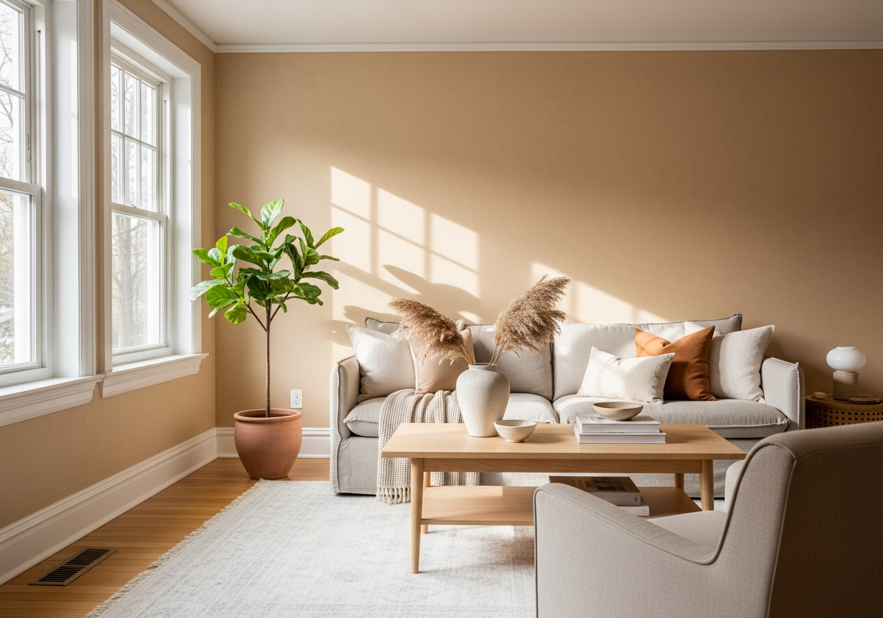
Sand color paint brings the calm feeling of a beach day right into your home. This warm neutral works like magic with almost any decor style you already have, creating a space that feels both inviting and peaceful. Its subtle warmth adds a gentle glow, making rooms cozy without overwhelming your eyes or clashing with your furnishings.
One of the main reasons sand tones are so popular is their ability to bring visual warmth without stuffing the room with color. Unlike stark whites or cool grays, sand creates a soft backdrop that feels natural and grounded. This color doesn’t just fill the walls—it sets a mood of calm and balance that can soothe the mind. Psychologically, colors in the sand spectrum are linked to feelings of stability and relaxation, offering a quiet anchor in busy living spaces.
Sand paints also offer unmatched versatility. They adapt well to changes in furniture and decor, whether you prefer bold colors or muted shades. This makes them perfect for seasonal decorating or gradual design shifts over time. The light-reflecting qualities of sand paint play a big role here too. They can brighten a room by bouncing natural and artificial light, making small or dim spaces feel more open and airy.
The Science Behind Sand’s Universal Appeal
At its core, sand is a blend of beige, yellow, and sometimes gray tones—colors often found in nature. Humans naturally respond positively to these hues because they remind us of earth, sand, and warmth. This triggers comfort and safety, which is why sand colors tend to look good in almost any setting.
Scientifically speaking, sand tones hit a sweet spot on the color spectrum. They provide enough color to prevent walls from feeling cold or sterile but remain soft enough to avoid visual clutter. This balance helps maintain a peaceful atmosphere, which is ideal for a living room where people relax and gather.
How Sand Tones Compare to Other Popular Neutrals
Compared to grays, sand colors are warmer and more inviting. While grays can sometimes feel cold or stark, sand tones bring a gentle warmth that encourages comfort. Whites, on the other hand, offer brightness and cleanliness but can appear washed out without enough texture or depth.
Unlike pure beige, which sometimes edges toward yellow, sand paint often carries a bit more complexity, balancing subtle gray or pink undertones. This creates a richer, more natural look that changes beautifully with light throughout the day.
Choosing Your Perfect Sand Paint Shade: From Warm Beiges to Cool Taupes
Not all sand colors look the same on your walls. The right shade depends on your room’s natural light and the mood you want to create. If you want warmth and coziness, warm sand tones with hints of yellow or peach work well. For a cooler, more modern feel, shades leaning toward taupe or gray might be a better fit.
Undertones make a huge difference in how your paint color reads. Yellow undertones can make a room feel sunny and bright, but too much might look dated. Pink or red undertones soften the beige and add a subtle warmth that pairs well with wood furniture. Green undertones can provide a fresh, earthy backdrop but risk clashing with other colors if not balanced carefully. Gray undertones offer sophistication but can sometimes dull a room if overused.
Many brand collections offer popular sand shades that suit different tastes. Sherwin-Williams, Benjamin Moore, and Behr each have several options that vary from creamy beiges to soft taupes. Before committing to a full room, testing samples on your wall is crucial. Paint swatches look very different in small patches than they do covering an entire room. Sampling helps you see how the color reacts to your specific lighting and furnishings.
Reading Undertones Like a Pro
To identify undertones, start with a swatch about the size of a hand and observe it at several times of the day. Natural morning light shows the color’s truest form, while afternoon and evening light might bring out hidden hues. If the color appears rosy or peachy, it likely has warm undertones. If it looks more muted or dusty, it may tilt toward cool undertones like gray or green.
You can also hold a white piece of paper next to the color sample to help see subtle tones. Pay attention to what colors in your furniture and decor complement or clash, as undertones can make the same sand shade look very different depending on pairing.
Top 10 Sand Paint Colors from Sherwin-Williams, Benjamin Moore, and Behr
| Brand | Color Name | Description | Undertone |
|---|---|---|---|
| Sherwin-Williams | Accessible Beige | Soft beige with slight warmth, easy to match with many furnishings | Warm – Yellow |
| Sherwin-Williams | Balanced Beige | A calm, neutral beige that pairs well with both warm and cool tones | Neutral-Warm |
| Benjamin Moore | Manchester Tan | Warm sand with subtle pink undertones for a cozy feel | Warm – Pink |
| Benjamin Moore | Revere Pewter | Light gray-beige that adapts to lighting changes well | Cool – Gray |
| Behr | Sandstone Cove | A creamy, sandy shade with soft warmth | Warm – Yellow |
| Behr | Natural Taupe | Earthy taupe with greige undertones for a modern neutral | Cool – Gray/Green |
| Sherwin-Williams | Fawn Brindle | Rich sand with a slight brownish base, perfect for cozy spaces | Warm – Brown |
| Benjamin Moore | Shaker Beige | Classic beige with balanced warmth | Warm – Yellow |
| Behr | Desert Tourist | Light sand with subtle peach undertones | Warm – Peach |
| Benjamin Moore | Edgecomb Gray | Neutral sand leaning toward gray, great for calm rooms | Cool – Gray |
How Natural and Artificial Light Changes Your Sand Color Paint
That gorgeous sand color you picked might look completely different at night. Light direction and bulb type can turn your perfect beige into an unwanted yellow or gray, so it’s important to understand the effect of both natural and artificial light on paint.
Rooms facing north usually get cooler, indirect light. In these spaces, warm sand tones often look muted or even slightly gray. You might want to choose a sand shade with warmer undertones to balance the cool natural light and keep the room feeling inviting.
South-facing rooms soak up lots of warm sunlight all day long. Sand colors with cooler undertones can work well here, preventing the space from feeling too yellow or orange. But bright sunlight can also highlight flaws or unevenness in paint, so opting for eggshell or satin finishes helps soften that effect.
Artificial light adds another layer to consider. LED bulbs tend to be cooler and can make warm sand paint look more washed out or greenish in tone. Incandescent bulbs emit warmer, yellow light that can deepen the warmth of sand colors, sometimes too much, making the walls feel darker or orange.
Daylight bulbs are designed to mimic natural light and provide a more neutral white glow. These can help your sand color stay true to its intended shade at night. Using dimmers allows you to adjust the brightness and create mood lighting that complements your neutral walls without overwhelming them.